
Build on a
Strong Foundation
TokenPx brings together universal design tokens and curated UI components built on the same system, helping teams design consistently without guesswork.
At TokenPx, we didn’t start by asking, “How do we create components faster?”
We asked a more fundamental question:
How do we build scalable design tokens that work across teams and platforms without compromising quality, consistency, or brand?
We repeatedly saw inconsistencies across products and touchpoints, including product websites, marketing materials, print, dashboards, and internal tools.
Design and development consistency issues
- Inconsistent spacing, typography, and color usage across screens and files
- Designers making subjective decisions instead of relying on shared rules
- Systems becoming harder to maintain as teams and products grew
- Longer review cycles due to manual visual consistency checks
Naming and discoverability problems
- Token names lacking clarity, hierarchy, or intent, turning selection into guesswork
- Overuse of generic patterns like t-shirt sizing (XS–XL) across unrelated token types
- Folder structures and naming conventions that worked for small teams but failed at scale
Scalability, aliasing, and flexibility limitations
- Component-specific tokens tightly coupling values to UI parts, leading to bloated token libraries
- Inconsistent or missing alias tokens binding semantic meaning too closely to raw values
- Overly restrictive typography systems that break when expanded to marketing, print, or enterprise use
- Restrictive color systems limiting exploration and causing contrast or accessibility issues
Contrast, Color Balance, and Real-World Usability
Even when teams invest time defining color tokens, issues often only appear in real usage:
- Over-bright colors that cause visual fatigue in dashboards and data-heavy products
- Dull or muddy palettes that reduce clarity, hierarchy, and energy
- Theoretical color scales that fail in real components, charts, and complex layouts
- Misuse of contrast, forcing high-contrast values everywhere and making interfaces feel heavy
- Primary color hierarchies breaking due to reactive accessibility fixes
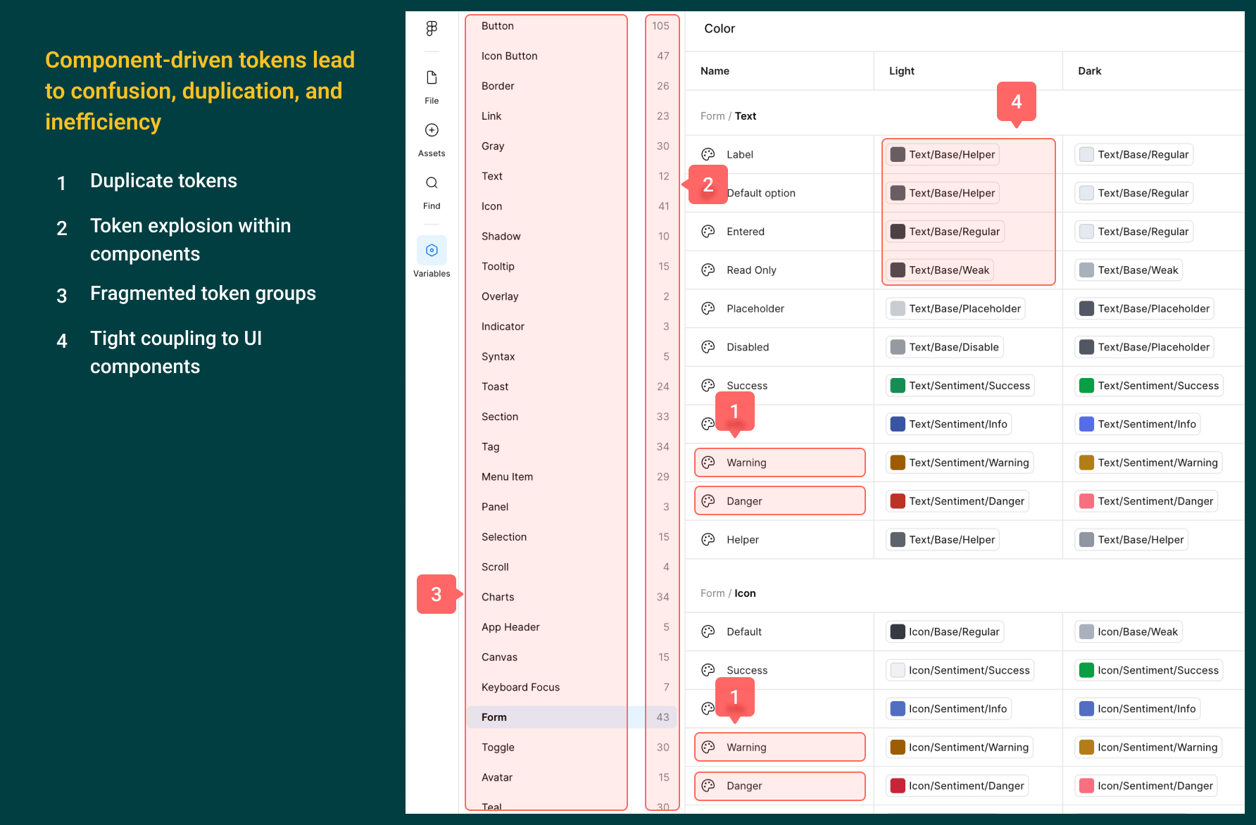
Example of a component-driven token system:
Built for a small application, this approach became confusing and unmanageable over time — with duplicated tokens, unclear intent, and increasing effort to use and maintain as the product grew.
A Long-Term Mindset for Scalable Design Systems
These challenges may seem manageable in small applications or early-stage products. But as systems grow across teams, platforms, and business needs, minor inconsistencies compound into friction.
Creating great design tokens takes time. It requires thoughtful planning, testing in real interfaces, and resisting shortcuts. That upfront investment pays off by reducing complexity, eliminating repeated debates, and enabling teams to move faster with confidence.
Design tokens should not be treated as a surface-level checklist. They must be intentional, flexible, and grounded in real usage.
Design tokens, done right, stop being a maintenance burden and become a quiet system that reliably supports designers, developers, and the business for years.
This is the mindset that guided us in building TokenPx Universal Design Tokens.
Introducing Universal Design Tokens at TokenPx
With nearly two decades of experience designing and building real products, marketing materials, print assets, dashboards, and enterprise tools, we wanted to create something different.
Universal design tokens.
Agnostic, foundational tokens that work consistently across platforms and touchpoints.
They are not tied to a single product, theme, or framework. They are designed to form a strong foundation first and evolve as teams, products, and platforms grow.
What we mean by “Universal”
Universal does not mean generic, restrictive, or one-size-fits-all.
It means intentionally flexible, structurally sound, and scalable.
TokenPx Universal Design Tokens are designed to:
- Work across products, marketing sites, dashboards, and internal tools
- Stay independent from specific components or UI patterns
- Avoid forcing semantic rules prematurely
- Scale without requiring redesigns or token rewrites
- Support different design directions while maintaining consistency
These tokens act as a design language layer, not a component layer.
They don’t dictate what to design. They give teams a reliable system to design with.
Crafted From Real Product Experience
TokenPx Universal Design Tokens were not built by following trends or copying existing systems.
They were crafted by hand, based on real-world constraints:
- Real UI components
- Real layouts and spacing requirements
- Real typography challenges
- Real color usage across light backgrounds, data-heavy screens, and charts
- Real handoff friction between design and development
Every value, scale, and naming decision was tested against practical usage, not theory.
The first release is intentionally focused and foundational, avoiding over-engineering. What exists today is immediately useful and designed to evolve.
Structure First, Scale Second
A core principle behind TokenPx Universal Design Tokens is simple:
Structure first. Scale second.
Instead of starting with hundreds of tokens, we focused on:
- Clear categorization
- Predictable naming
- Logical value progressions
- Separation of concerns (core, support, charts, and more)
This ensures tokens are usable from day one and that future growth does not break existing designs.
What this means in practice
- Avoiding t-shirt sizing across unrelated token types
- Using value-based naming where clarity matters
- Separating core colors from support and chart colors
- Treating alias tokens as a first-class concept
- Leaving room for growth without forcing redesigns
Typography and layout built with intent
- Line-height tokens are intentionally linked to font sizes for consistent rhythm
- Grid and breakpoint tokens follow a consistent layout rhythm across real screen sizes
- Font sizes are organized by purpose: Display, Large, Base, and Tiny
A System Designed to Evolve
Universal design tokens are not meant to be final.
They are designed to:
- Be extended
- Be aliased
- Be refined
- Be versioned over time
TokenPx Universal Tokens are just the beginning. As teams use them in real projects, we will continue to:
- Learn from feedback
- Improve clarity and coverage
- Expand thoughtfully without bloating the system
- Maintain backward compatibility wherever possible
Our goal is not to ship more tokens.
Our goal is to ship better foundations.
Token Categories in TokenPx
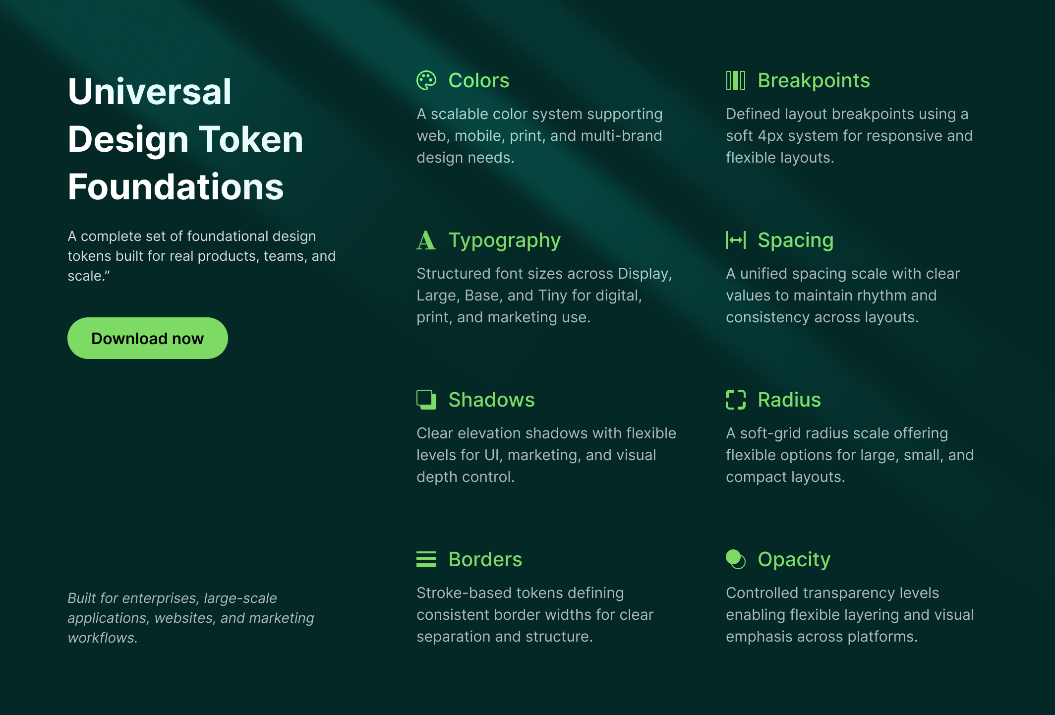
To support a wide range of design needs, TokenPx Universal Design Tokens are organized into focused foundational categories.
In version 1, TokenPx includes tokens for:
- Breakpoints
- Colors
- Typography
- Shadows
- Radius
- Spacing
- Borders
- Opacity
Together, these categories cover the most common and critical design decisions teams make every day.
In the sections that follow, we’ll walk through each category and explain how to use them effectively in real-world designs.
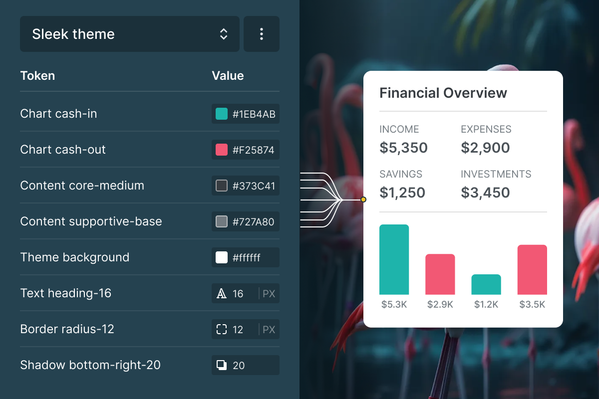
Color Tokens at TokenPx
Color is one of the most powerful, and most misused, parts of any design system.
At TokenPx, we did not design colors for buttons or cards.
We designed universal color foundations that remain stable as UI patterns and platforms evolve.
Our goal was to build a color system that:
- Scales across teams and platforms
- Supports multi-brand environments
- Works for product UI, marketing, and print
- Reduces subjective decision-making
- Preserves brand quality over time
- Holds up in real-world usage
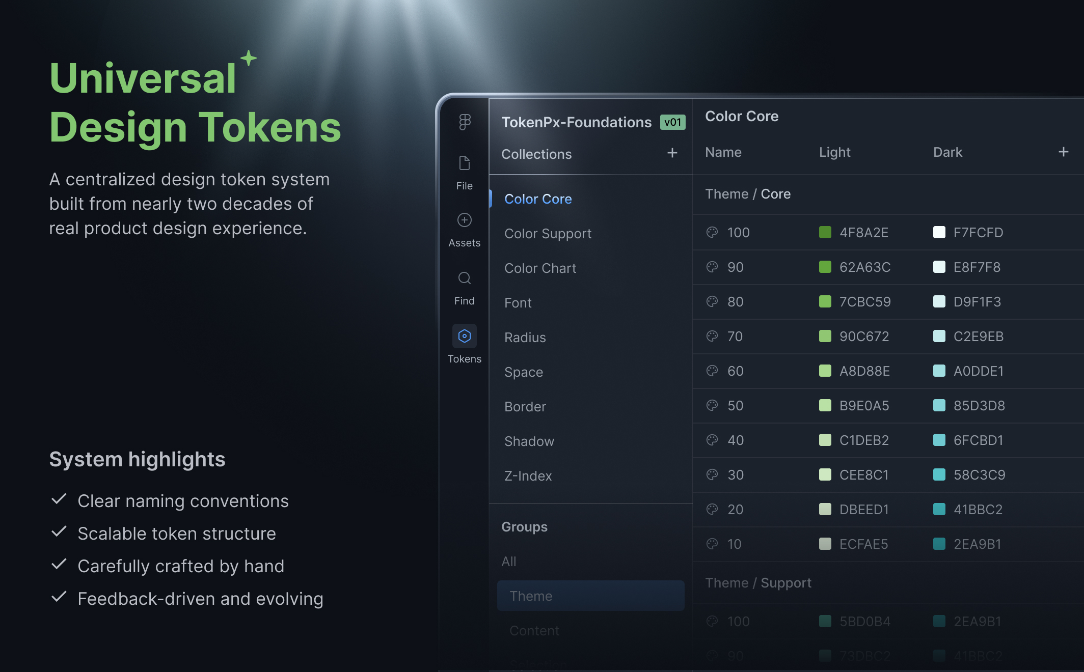
How TokenPx Color Tokens Are Structured
To avoid bloated color libraries, TokenPx colors are separated into three clear collections:
- Color Core
- Color Support
- Color Chart
Each layer solves a specific problem while working seamlessly with the others.
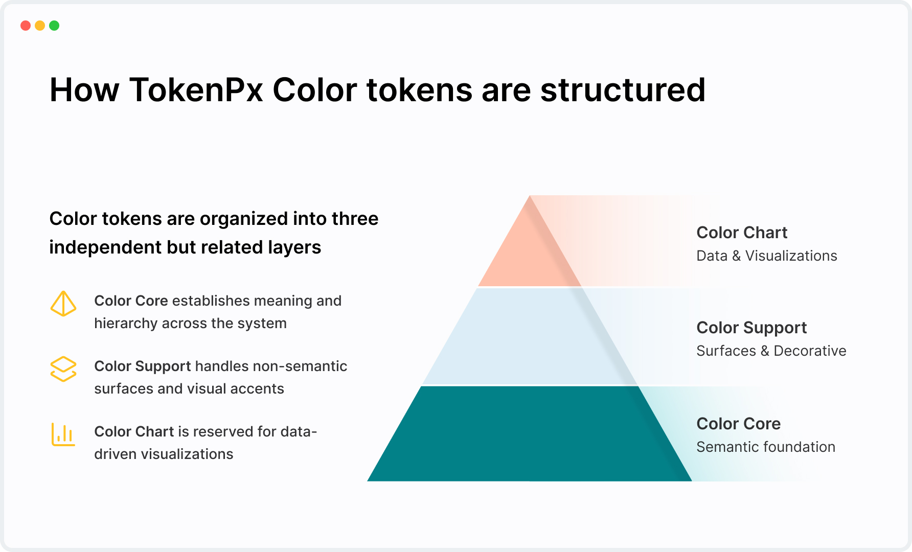
Color Core: Meaning Before Components
Color Core defines why a color exists before where it is used.
Instead of tying colors to components, Color Core is designed around intent and meaning, allowing colors to scale across products and platforms.
Built around purpose, not UI parts
The same color system works across:
- Products
- Websites
- Dashboards
- Marketing pages
- Print materials
- Future platforms
Alias tokens act as a buffer between design intent and visual output, allowing safe evolution without refactoring components.
Designed for readability and hierarchy
Color Core emphasizes:
- Content hierarchy
- Visual contrast
- Legibility on light surfaces
- Clarity in dense interfaces
Accessibility is treated as a foundational concern, not a late-stage fix.
Color Support: Flexible Without Breaking the System
Not every color needs semantic meaning.
Color Support handles:
- Background surfaces
- Section highlights
- Card fills
- Subtle accents
- Decorative usage
Why this layer exists
Without a dedicated space for non-semantic colors:
- One-off values creep in
- Temporary decisions become permanent
- Core palettes lose clarity
Color Support provides controlled freedom without polluting Core decisions.
Color Chart: Built for Data, Not UI
Data visualization has different requirements than interface design.
Color Chart exists as a dedicated layer to support:
- Clear differentiation
- Strong contrast
- Multi-dataset charts
- Scalable dashboards
This separation ensures data clarity never competes with interface clarity.
Tokens Alone Are Not Enough
Universal design tokens establish consistency, structure, and intent across a system. But in real workflows, teams often face a practical question:
“Which token should I use here?”
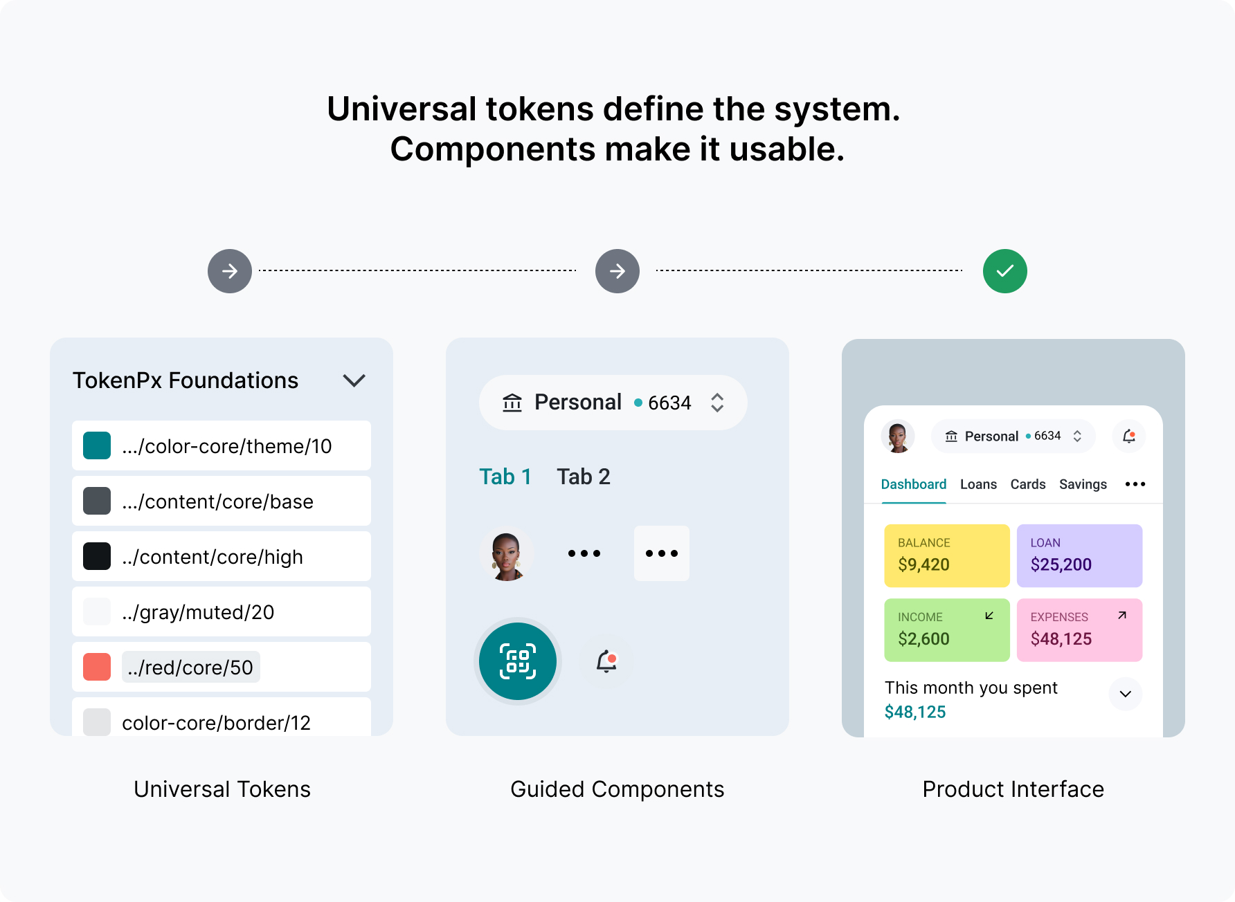
Tokens define rules, but they don’t always demonstrate application.
To bridge that gap, TokenPx pairs universal tokens with a curated set of foundational UI components built on the same system. These components are not rigid templates — they act as living references that show how tokens work together in real interface patterns.
By providing both the rules and practical examples, the system becomes easier to understand, apply, and extend without guesswork.
Advanced components remain optional and separate, ensuring the core foundation stays lightweight while allowing teams to expand when needed.
One Lightweight Foundation
All universal tokens and basic UI components live in a single Figma file:
TokenPx-Foundations-v01
This includes:
- Universal design tokens
- Essential UI components
- Token-driven styles
Designers get rules and real-world references together, fast to load and easy to adopt.
What You Get With TokenPx Universal Design Tokens
When you download TokenPx-Foundations-v01, you get:
Included token foundations
- Colors: Core, Support, and Chart
- Typography
- Spacing
- Breakpoints
- Radius
- Borders
- Shadows
- Opacity
- Z-index
Basic UI components included
- Token-driven components
- Real-world usage examples
- Safe defaults for common patterns
Tokens remain the source of truth.
Start with Universal Design Tokens
Build products instantly with ready-to-use universal design tokens that work across platforms and teams.
